MULTISMS
The studio has developed a one-page (landing) promotional website for the corporate SMS mailing service Multisms.
The site introduces visitors to corporate SMS sending services. you can know the advantages of this tool, its prices, as well as request a trial period directly on the website. For the convenience of communication, the site provides a live chat with visitors.

TRUCKWASH
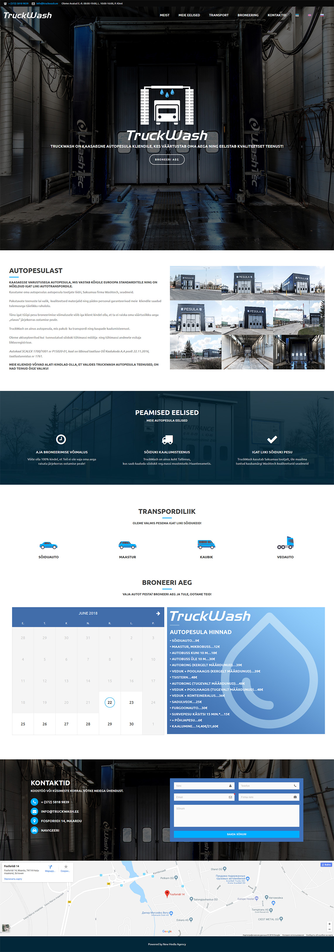
The studio developed a one-page (landing) website for truck washing.
On the site you can see what the car wash looks like, where it is and what services it provides. In addition to information on the car wash, it is possible to book a time directly on the site or ask a question of interest to the visitor via the contact form.

PAF AUTOABI
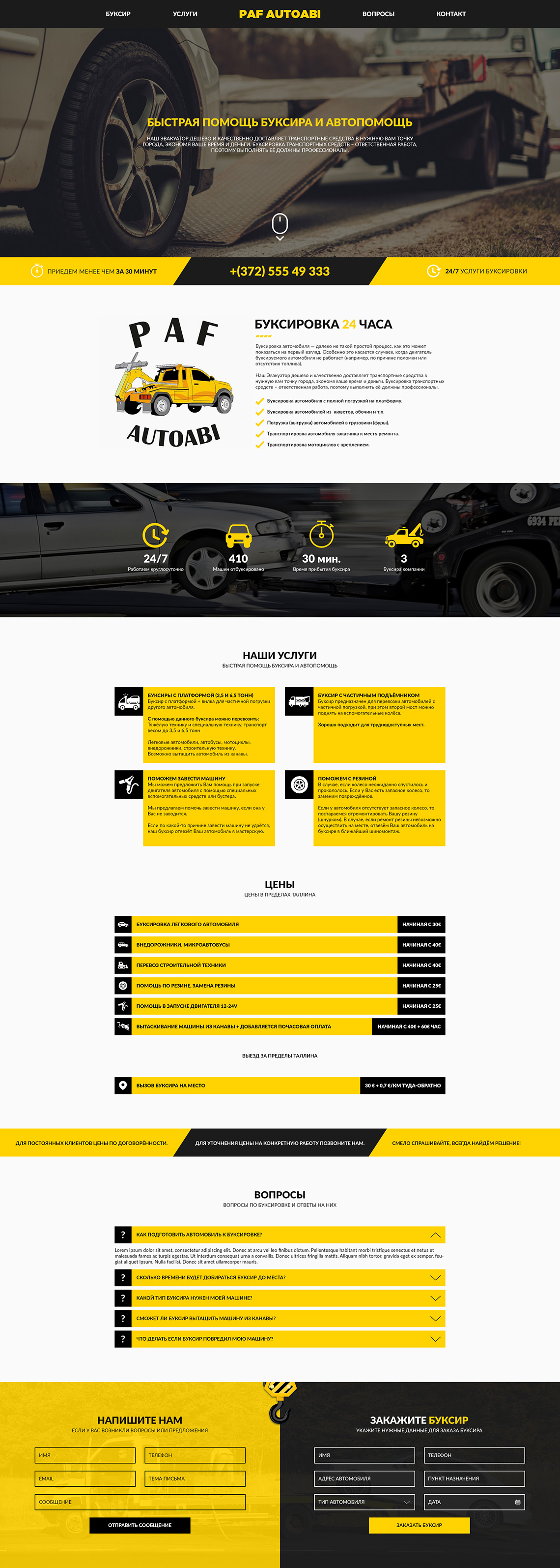
The studio developed the design of a one page website (landing page) for the towing service.
The site is made with the company’s corporate colors, yellow and black. The site has all the necessary information about the service and its conditions in an accessible form. Here, too, you can find information about the company’s secondary services, prices, and see answers to frequently asked customer questions.

SOVAROS
The studio developed a one-page (landing) website for the repair and installation company Sovaros.
The site contains all the necessary information on the company’s activities and its contacts. Important elements of the site are blocks with galleries of the company’s completed work. Here you can also get to know the partners of the company and the materials used in the work.

BOUCHE CATERING
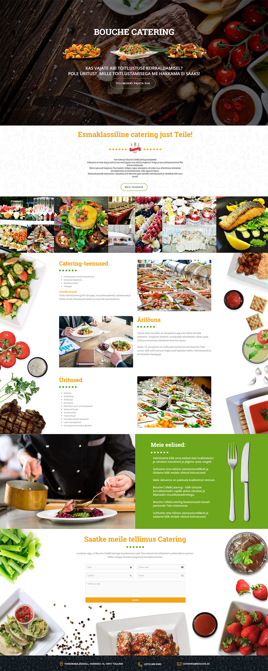
The studio has developed a colorful one page website (landing page) for a catering company.
On a food website, the most important thing is to show the food itself. That’s exactly what the studio did, decorating Bouche Catering’s one-page website with collages of food photographs. Thanks to this approach, it is interesting to read on the site not only the services, but also to look at the images. After reviewing all the nuances, the visitor can submit a catering application directly from the site.

RaahEest24
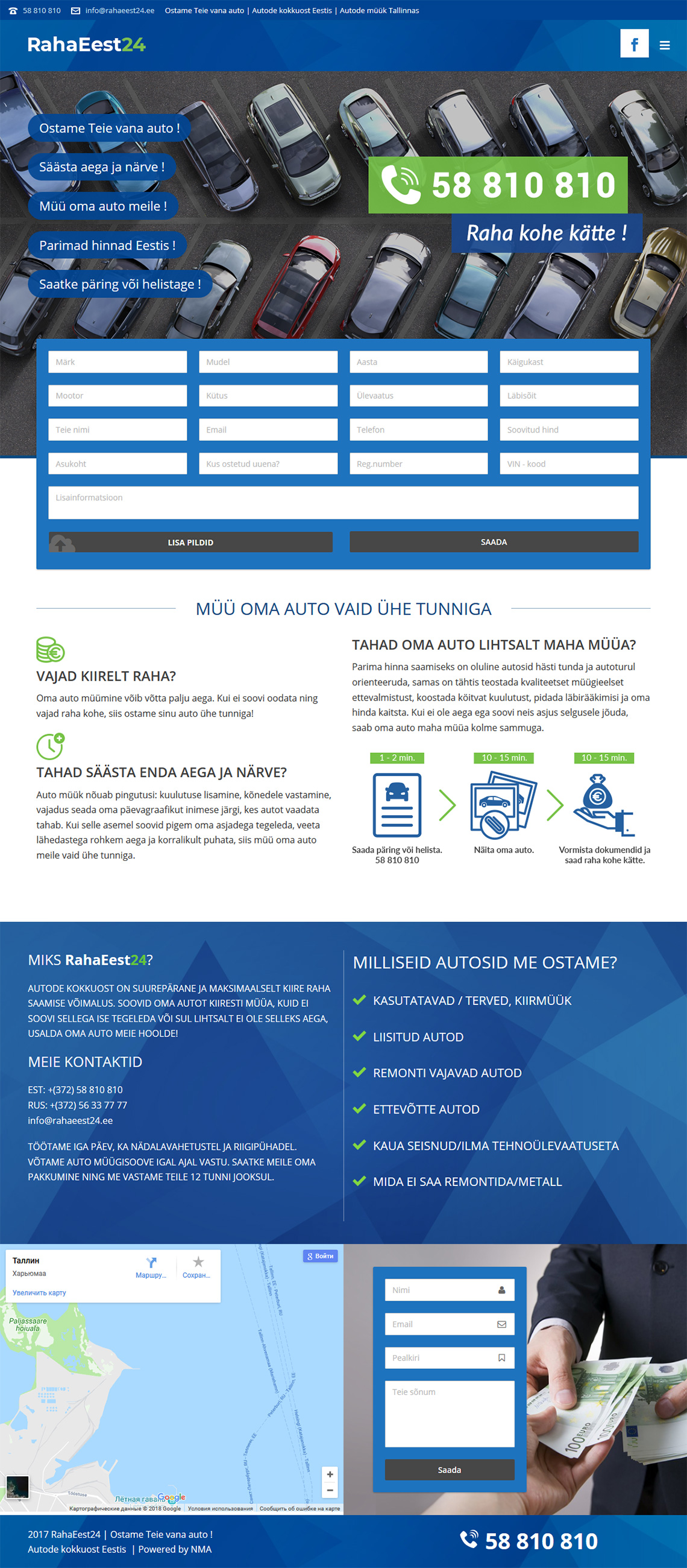
The studio has developed a one-page (landing) website for the dealer RahaEest24.
The main idea behind this site was to provide the visitor with the most important information and features, without being distracted by unnecessary details. Thanks to this, the RahaEest24 website looks very laconic and fulfils the assigned tasks to the maximum. On the site you can familiarise yourself with the terms of car purchase, as well as fill out an application for the sale of your car.

LASTEALBUM
The studio has developed a colorful one-page (landing) website for the sale of the graduation photo album service.
The site’s task was to introduce visitors to the graduation photo album creation service for kindergartens. The cartoon characters, icons, and bright colors give the site a childlike feel. On the site you can study in detail the albums, their examples, prices and stages of creation.

.png)
.png)